So I continued whacking away at the same piece I’ve been working on for the last two weeks, yadda yadda yadda. However, this time I did not start over, instead using the oft-maligned (or praised, depending on which tutorial you’re reading) Smudge Tool along with Fill Layers…
Wait. Do you speak Photoshop? Probably not. How can I put this so that it makes sense…
As briefly as possible (which is still probably pretty long; if there was a “spoiler” feature, I’d use it here):
Well-made Photoshop documents, like ogres, onions, parfaits, and a lot of other things, (often) have layers. Some of these layers, the Fill Layers that I mentioned previously, are special layers that are kind of like cheating.
Basically, these layers rely on how much “pigment” there is in (read as, how often you’ve used your painting tool of choice) a given location of the virtual canvas to determine what the layer shows- either there’s some of the color or there isn’t. If you’re painting lightly, then the layer can show a gradual buildup of color, as if you were actually painting. In fact, the layer only allows you to work with two “colors,” content and absence of content.
The reason that this is important is that since you’re not actually working with colors (Photoshop keeps the color information for each Fill Layer separate), you can go back and change the colors of each Fill layer individually. This is great for me, as I tend to pick very bright colors off the bat and then wish I could change them without wrecking my piece.
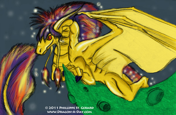
Anyhow, now that I’ve tried to explain something that you don’t really care about, this is what I ended up with after two hours of playing with layers and smudgy colors:
 It’s a bit of an improvement over the obvious brushstrokes of last week’s attempts at rendering, though as I work on it I realize that the sketchiness of the linework is working against me, making what I have done look somewhat out-of place. The texture on the moon is a little wonky; I’ll probably take it out or tone it down.
Originally I had wanted stars in the background, but with the floating sparkles around her mane, it gets more than a little confused. Also, the Very Dark Background (which was supposed to be outer space-y) was swallowing up the lines on the outside, which might not have been a bad thing, but I didn’t like it.
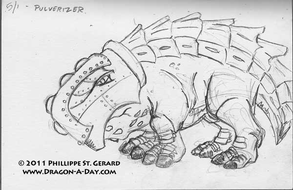
And I was thinking of a Catastrophic Dragon sketch that I had done sometime last year while the blog was offline. The Avalanche Dragon was a heavyset dragon similar in composition to the Earthquake Dragon, but much more top-heavy. Thinking along those lines made me want to come up with something similar but perhaps a little more thought out:
I kept thinking of the word “Pulverizer,” so it sticks. It seems a little similar to the War Dragon– a heavy-bodied heavily armored (natural and worn) dragon, although I modeled the legs after a rhinoceros’. I tried to capture the loose folds of skin that a rhino has, but I’m not sure that I succeeded. I’m not thrilled with the helmet, and the osteoderms along the jaw probably need some work, too. But I like the concept, and will come back to it sometime soonish.


